Sometimes I felt like this day would never arrive. After a few years of collecting recipe ideas, the summer of 2015 spent recipe testing, months of writing,...
Read MoreMayo Photos – Please Vote
Our crazy summer of cookbook production is quickly winding down. We now have just 20 days until our cookbook deadline – and a few days ago, while doing photo editing, we hit a snag! Dave and I couldn’t agree on which mayo photo to use.
In the general scheme of things, this surely seems like a minor dispute. But decisions must be made! Files must be processed! Spreadsheets must be completed! Ts must be crossed; Is must be dotted! WE HAVE TO FINISH THE COOKBOOK!
And that’s where you come in. Please feast your eyes on the photos below for my homemade mayo, then vote in comments.
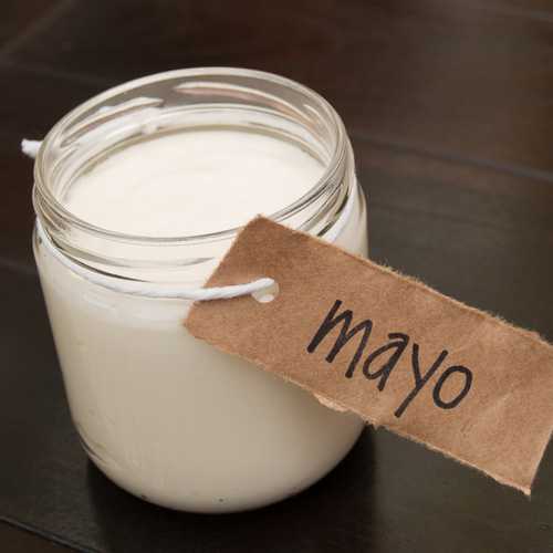
Do you prefer Mayo #1: Outside or Mayo #2: Inside? Thank you in advance for your valued opinion on this vital matter.
Mayo #1: Outside
Mayo #2: Inside
More Like This...
Remember when Dave and I went to Prague in November for the release of the Czech version of Well Fed — a.k.a., Dobře živeni? The book has...
Read More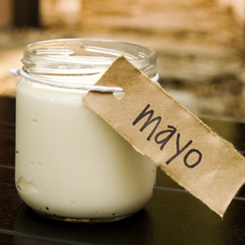


I can see why you’re torn…I’m going with #2
Outside Mayo, #1. The lighting on #2 makes it look too white–like commercial mayo (or coconut oil). The first photo is much warmer, and I like the fuzzy, glowy background. It gives more interest and depth to the photo.
Mayo #1
I actually like Mayo #1 better. It has more of an “earthy” tone to it. I think the angle is better too.
Ditto what James says.
inside …. looks cleaner/more pure
It’s may #2 for me.
Mayo #1 =)
#2!
Definitely the Mayo #1, outside. The lighting and picture quality is better. 🙂
I like mayo #1. Mayo #2 looks like paint — I think the whiteness is off.
the mayo – second
the photo – first, because of the colors
mayo pic #1 is my vote, it looks more creamy and mayo-ish (to me lol)
I like #1.
#1 looks like mayo. #2 looks like marshmallow cream.
Mayo #1
CFA morning crew votes on Mayo #2. It’s more mayo-y! Better coloring, more visual interest, and you can see the texture of the mayo on the bottom left of the jar.
(Veronica says mayo #2 looks like elmers glue, ew, ha)
**TYPO! CFA crew votes for Mayo #1, sorry.
I say mayo #2. Something about a big, open jar of may outside creeps me out.
Mayo #1: Outside
from a photography perspective the composition of #2 is better. the lighting is better on #1. also depends on what the lighting or photo style of the rest of the book is. any way that you can re-shoot the mayo outside, but from the same angle as #2?
Mayo #1 – it looks more mayo-ee
Mayo #1- looks more like delicious homemade mayo! Can’t wait for the cookbook!
Thanks, Donna! I’m wrapping up the content production this week. Things are happening fast now!
Mayo #1 looks more real, if that makes sense.
#1 for sure. While the composition of #2 is better, it looks like a jar of glue.
Mayo #2.
I say #1.
Mayo #2.
Mayo #1
love the mayo #1 photo!!
Mayo 1
Mayo #1!!
My vote goes to #1, but I agree, I can see why it’s a tough choice!
#1 for me Mel! #2 is too white, and looks more like rendered fat to me.
#1…hands down!
number 1, no question.
Mayo #1 for sure!
OUTSIDE! I feel like I’m at derby 😉
#1! #2 looks fake.
#1 is better! #2 looks fake.
#1 is a great pic and looks like Mayo to me. At first glance, #2 looks like coconut milk.
Mayo#1 looks way more appetizing in my opinion.
#1
Mayo 1 is my vote! I like the position of the other photo, but it looks too white (more like yogurt) so 1 wins for me!
Mayo #1, looks just like my Jar!
#1
Mayo #1!
Lovin Mayo #1
Mayo #1 looks like the mayo I’d want to make.
mayo #1
#1 – but can you photoshop out the black spots at the bottom? And perhaps crop closer? I agree with the comments about lighting and #2 being too white.
I prefer #1, and for the record, your mayo recipe rocks, and will continue to make it regardless of which photo you choose!
YAY! Thanks, Harmony! That mayo really is magic. I eat it on just about everything!
Mayo #1 just has a more delicious vibe!
I’m voting for mayo #1.
Outside 🙂
Definitely Mayo #1. Warmer, earthier, nice perspective (straight up/head on), nice blur. Good luck!
Mayo outside
#1!!!
Outside # 1. Looks more “made with love” not ” we manipulated every aspect of this mayo so yours will never turn out to look like the picture”. #2 just looks too perfect 🙂
Mayo #1 !!! coloring is so rich.
#1 – definitely!
By the way – new to your blog (jumped to it from Nom Nom’s site) and I love it. Now a faithful follower. My mom had thyroid cancer 3 years ago and had her entire thyroid removed. I’ve been trying to convince her to go Paleo (I’m becoming more devoted by the week).
Thanks for all of the yummy recipes and insights! Can’t wait for your cookbook.
Welcome, Shasta! I’m glad you found me.
I had my thyroid removed, too — it’s not so fun dealing with the aftermath. I hope your mom decides to try paleo. It’s helped me tremendously. Feel free to shoot me email if you want to discuss 1:1. mel@chancemccoy.com
Mayo #1, Mayo #2 looks like a candle!
Both the pix are lovely – it’s always a challenge to get emotion in to still life images.
I like the composition and depth of field of #1…
And I’d love #2 if it had finger with a dollop of mayo on it – looking like it was ready for licking – Mmmmm!
Colour doesn’t really matter as you can change all that – I’m a newish reader here – but feel warm sensual pix suit your style really well.
Both pictures might be even lovelier if they either had the whole label included or a more dramatic crop.
Chop chop – I can’t wait for your book either! 🙂
Cookbook is happening as fast as we can!
I’m not going to be able to vote until I taste them both LOL Very hard decision but I think I like #2 best
#1 looks like mayo. #2 looks like a number of white creamy substances.
I’m torn. 🙁
I like #1 in terms of the mayo color, but am not a huge fan of the background hue. I like #2 in terms of the angle and background color, but the mayo itself looks like cream.
#2 – I can totally see why you’re torn though! 🙂 I think 2 shows off the finished mayo better (top, side, etc) – even if it looks really white. Can’t wait to see the book! And I heart your labels, so clever!
I prefer Mayo #1: Outside – The photo looks more natural. In photo 2 the mayo looks too white and it looks like it’s on a lab bench.
Im going with #2–you can see what it looks like and I dont think there is a problem with whiteness in the picture.
Mayo #1. Mayo #2 looks scarily too white for me. Funny how light can play tricks with your mind/stomach…because this is the same mayo batch.jar in both photos, right?
Yep. Exact same jar. Same table. Different light.
Mayo #1
mayo #1, for sheezy
I actually liked the original image you had on the mayo recipe page as it provided this rookie mayo maker with an idea of the color and texture I was shooting for. The two options above are great, but they don’t tell me much about the mayo(but of the two, I like #1). Love the recipe (NEVER thought I would be making my own mayo) and look forward to the book!
1# Outside… It looks like mayo in that picture as opposed to blown out white of the second one.
#2 – I like the angle
Outside…the inside one is unnaturally white 🙂
Definitely mayo 1.
The hints of what the book will look like are so damn promising. I look forward to see the finished result.
Will you be shipping to Denmark as well? 🙂
The book will be available on Amazon, so I’m sure we can figure out a way to ship the printed book to Denmark. It will also be available as a downloadable PDF so you’ll definitely be able to get that one anywhere!
I like “Mayo #2: Inside” better of the two.
That said, what about showing the mayo in the context of some other food? I’d just gloop some on a leaf of lettuce or cabbage and set that next to the jar. Makes it look more “yum-I-want-to-put-that-in-my-mouth-now” and adds a bit more color.
Hmm it’s hard to say without having seen any other photos from the cookbook, but I’m going to go with #1 because it looks more mayo-y! #2 looks too milk or glue-y. 😉
I prefer Mayo #1 – Outside. It’s just such a good shot! And it makes me want to make your mayo.
#1 fo sho
#1! Looking forward to your cookbook. 🙂
#1 for me too.
#1
Definitely number #1. Has a much more natural, homemade feel to the picture.
Definitely mayo #1. #2 looks like milk to me.
Mayo #1.
Thanks so much, everyone, for voting. I really appreciate your input!
Mayo #1. I have to tell you that I know it’s a landslide but I wanted to vote!! Plus, guess I was channeling you today and decided to whip myself up some mayo. I follow your directions everytime, except for some reason today and I got my very FIRST mayo FAIL. So I jumped on to see what you’d tell me to do about a fail … and here you are asking for mayo picture votes. Anyway, I know what I did wrong. It’s the patience part – I was in a hurry and now I am paying the price. My “slurry” tastes good, but is not creamy.delicious.ohmygoodness.I.can’t.stay.away.from.it.good. Call it LESSON LEARNED.
Can’t wait for your cookbook MEL! 🙂
Even I get a mayo fail once in a while. I had one a few weeks ago ’cause I was experimenting with technique. Silly me!
Thanks for the cookbook enthusiasm!
I like the warmth of #1 but I think #2 is focused better. Maybe try running a warming filter on #2?
#1 outside!
I definitely prefer the mayo outside photo. 🙂
Outside for sure. The colors are better and the overall composition of 1 is a little more appealing, to me, anyway.
Mayo #1, makes me want to make it.
#1 fo sho. More true to color. 🙂
my vote is for #1
#1 makes me want mayo.. RIGHT NOW!!!
#2 looks like glue to me
Mayo #1 looks more like mayo. I think number 2 looks like a handmade candle without the wick… too pure.
Can’t wait till the release of your new book!
#1 absolutely
Mayo #1 Outside is my choice. I enjoy the colors in this photo entirely more than the inside photo.
I think #1.
Outside. Inside looks like milk or yogurt.
#1.
#1
Ill vote for #2.
I like #1, you can see the little air bubbles and it makes it look like home made mayo and not coconut oil like in #2
#1- fo sho. #2 looks like glue to me. 😉
I CANNOT wait, Mel!!!!
#1… LOVE your site, been following it since April. I love the way you right, and I am SO excited for your book!!
Cheers
I vote #1!
Mayo #1 – Outside. Looks more real, home made, better colour. Wanna eat NOW.
#1
In case there was ANY hesitation after the 992nd vote- #1. It rocks. Natural lighting, texture, not as marshmallow/paint looking as #2… neither of which are Paleo/Primal. 😉
STOKED for your cookbook to come out. Can’t can’t wait.
Mayo # 1 because Mayo #2 looks like Marshmello Fluff (not that there is anything wrong with that!!!!). xxoo Mom
#1
Definitely mayo #1. Great shot!
Even though it looks like you have plenty of votes, I also prefer #1 Outside.
The first votes were mixed and I was wondering if some people’s monitors were calibrated warmer or cooler and that was influencing their decisions, but I have f.lux installed so everything should be pretty warm and the second pic looks too white to me too.
#1.
#1 – outside! Much better ambience and the mayo has so much more depth, like it wants to jump off the page and into my mouth. 😀
You know, I have DEFINITELY had the experience where the mayo jumped into my mouth! 😉
Numero UNO!
Mayo #1 outside
Definitely #1. I agree with Karyn, #2 looks like marshmellow cream, not mayo-like at all.